First impressions are always important. Think about it- if you were interviewing someone for a job and they came in with their hair unbrushed, a mismatched outfit and with no knowledge of the position’s requirements, you would form an opinion of them pretty quickly, right? Well the same thing happens with your website.
The first time many of your prospective clients hear about your company is when they are directed to or come across your website. If your website appears hastily put together and doesn’t present a clear idea of your company, what type of first impression are you giving to your users? Websites are a crucial aspect of any company’s marketing strategy.
If you want to increase user interaction on your website, you must make your company’s mission, vision and values crystal clear. A value that every company should prioritise is trustworthiness. If your website does not prove to users that you are experienced, efficient and trustworthy, how will they know that your brand is credible?
While many companies focus on the functionality aspect of their app, they don’t pay enough attention to its design, however, in order for your app to be successful, you must have a user-friendly UI design in conjunction with a high-functioning app. One without the other is insufficient. This article aims to explain how to create an attractive UI design and why it is an effective way to popularise your brand.
As a company, you should strive for a successful app and high customer satisfaction rates. By designing an easy to use, intuitive and organised user interface, customers will have a great experience and will return to do business with you again – naturally boosting your brand awareness. In order to make an impact with your brand through UI design, your goal should be to take your brand’s unique visual characteristics and instill them into the actual design. This creates a solid foundation for maximizing user experience, which you can build on in the future.
Remember the core values that successful businesses embody: usefulness, effectiveness and customer satisfaction. To ensure that your application or website encourages user interaction, we’ve curated a list of the best UI design trends:
1. Be Consistent in Your Design
A consistent UI design improves the overall user experience because it is visually appealing and simply easy to use. By incorporating similar or matching colours and designs on your interface items, such as buttons and links, users will feel familiar with your product quickly. When users feel familiar with your product, they feel more comfortable with your product and are thus more likely to support your brand. To take it one step further, you can also apply your company’s existing colour palette or official font.
Using a branding guide or creating a style that’s unique to your company is a great way to implement consistency. Your users will be able to immediately recognize this style as exclusive to your brand; consistency can inspire familiarity and confidence
2. Use Gradients and Bold Colours

The web design trends for 2017 have featured comebacks of gradients and bold colours. A few years ago, brands jumped onto the bandwagon of simple UI designs, so most websites began to look the same. Their similar design patterns and colour choices essentially meant that brands were stripped of their individuality. Designers now make use of bold colours and gradients to distinguish their site from others. One great example is Instagram’s recent logo change, which incorporated gradients in the company’s colour choices.
Psychology has proven that certain colours trigger specific emotions. For example, red is often associated with passion or anger and blue is often associated with relaxation. Additionally, vivid colors typically prompt happy, energetic feelings and gradients can incorporate many colors into a brand’s design. Be mindful of these factors when designing your brand’s logo and website, because you can use psychology to prompt your users to associate certain emotions with your company.
3. Make it Aesthetically Pleasing

Aesthetics and visuals are two separate aspects of design, although they are often conflated. Aesthetic design is a 4D experience that is comprised of multiple elements, including visuals. Aesthetically appealing products and websites are often more popular due to a phenomenon called “the halo effect.” Consumers are already expecting usability by default, so they look for a product that offers something extra.
An aesthetically pleasing design inspires loyalty to a brand, as it evokes positive emotions from users. Websites with an aesthetic design approach are likely to be more successful because the design catches the user’s eye and allows them to excuse usability issues that may otherwise be blatantly obvious. In fact, one study found that the overall aesthetics of a website contributed 75% to its credibility, which proves the immense power in aesthetic design approaches.
4. Use Timeless Website Designs
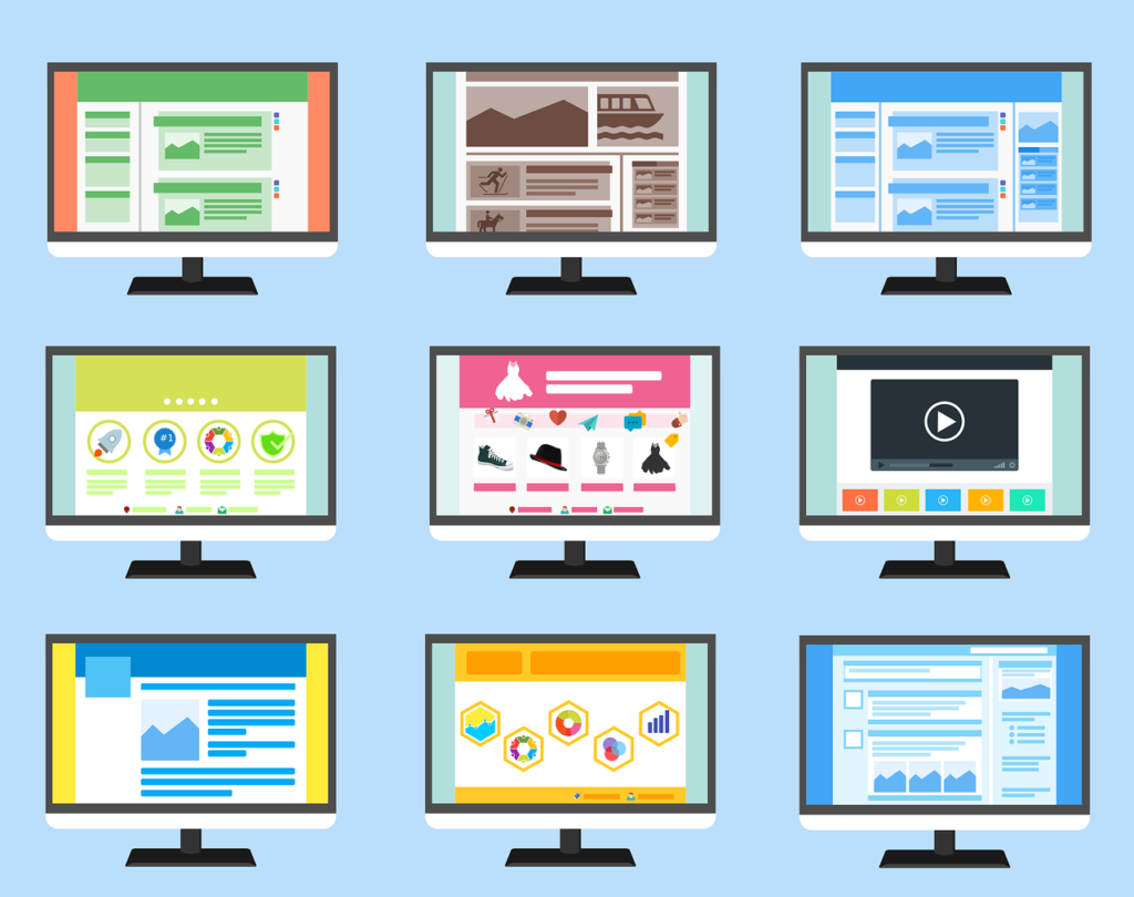
When in doubt, always lean towards timelessness. Brainstorming for UI designs can be a stressful process and sometimes you feel drained of creativity. However, the good news is that users are attracted to classic, timeless designs as well as new, innovative ones. Trends in the UI design industry come and go faster than you can respond. By the time you have chosen a design, there is already a new trend going around.
While it’s important that your products look modern, you should also ensure that the design elements are as time-tested as possible. You can learn quite a bit about the power of timeless UI designs by studying popular brands. A time-tested design will help you avoid having to go through inconvenient updates once the design trends inevitably change.
5. Encourage Immersive Experience Through Video
While stock photos are still useful to incorporate into your UI design, they are no longer your only option. Due to advancements in technology, you can access original photography and full-screen videos, which can provide a more immersive experience. A video is a useful tool because it catches the attention of users, mainly when used as full-page imagery. Moreover, if you blend your full-screen videos and images with typography, it can make your content personal and interactive.
6. Keep Your Designs Simple
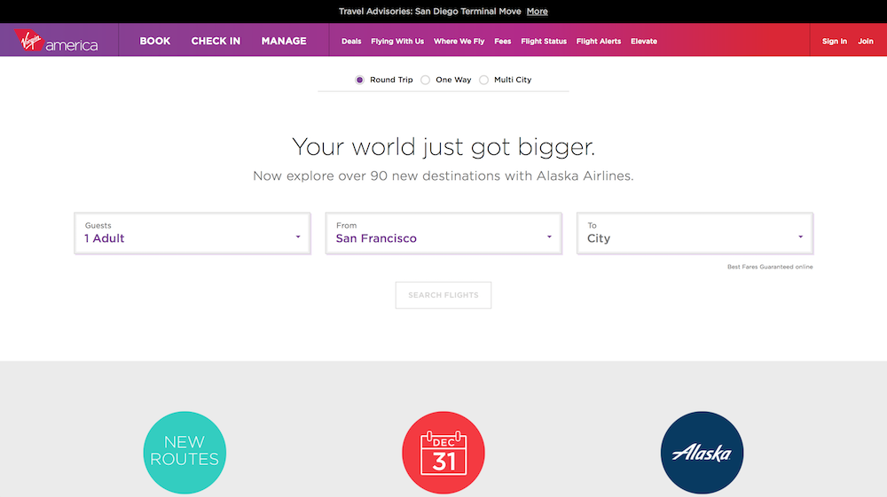
When you take a look at websites of some of the most successful brands, such as Apple and Google, you will immediately notice the simplicity of their UI design. There are no distractions, no misleading or unclear information and no excessive use of images. Typography is typically in a bold and expressive font, which is the core visual element of the design. The minimalistic approach helps users focus on the core feature by guiding their attention and resolve their issues quickly without getting distracted.
TO WRAP IT ALL UP
Choosing the right UI design for your brand can attract users and popularise your brand. By incorporating the above trends into your website or application’s design, you will be able to find the perfect balance between aesthetics and usability, which will set you apart from your competitors.
Our team of UI designers and expert developers at Ordia Creative work hand-in-hand to create website designs that are both visually appealing to the eye and easy to use. Our designs anticipate the needs of your company’s clients and encourage them to return to your website or app again and again. Talk to us to get started.
